MAP Rain selected as finalist for Wessex Water EDM monitoring Proof of Concept

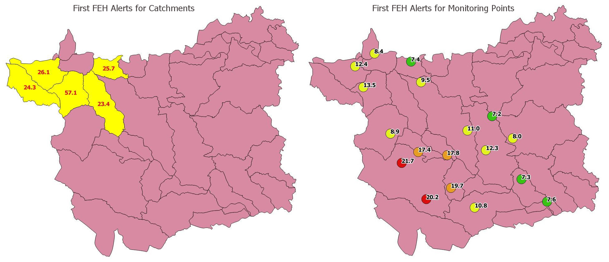
MAP Rain uses Machine learning for EDM monitoring to identify blockages and reduce the number of alerts generated from CSOs during wet weather

Meniscus are really pleased to be selected for the Wessex Water Proof of Concept looking at making smarter use of EDM monitoring data. MAP Rain has been chosen as one of three solutions to be trialed during the 3 month Proof of Concept. This follows a rigorous review of competition entries from 30 companies.

The trials will run for the next three months and will involve Wessex Water feeding these companies near real-time EDM data to see if they can correctly mute alarms and identify blockages, some of which will be simulated in a controlled environment.

Wessex Water Marketplace and objectives for the challenge

Strategic technology planning manager Jody Knight hopes to see a multitude of benefits from this data driven approach. These include reductions in blockages and CSO spills to alleviate impact on the environment, and lower volumes of alarms during rainfall periods, which will allow staff to work more efficiently and improve their reporting efficiency.

“The Marketplace approach has challenged the normal procurement channels for these emerging technical and data-related problems we encounter with our sewer network,” explained Jody.
“We have managed to communicate the problem to a wider supplier base and received proposals from companies that we may not have normally reached.

“The number of potentially viable and different solutions proposed by the companies in this challenge is encouraging to see as we move toward becoming a more data-centric business and we are grateful for all who have taken part in this challenge.”

Wessex Water launched its Marketplace in 2019 as a first-of-its-kind model for the water industry to increase collaboration with companies both in and out of its usual supply chain.

The online platform shares real data for each challenge that is posted and was designed to uncover alternative ways of managing water and waste, outside of the traditional asset-focused approach, leading to a better service and better value for customers.

More information on MAP Rain click here

For more information on the Wessex Water Marketplace click here

MAP Rain case study – Leeds City Council and storm Ciara

Case Study overview

Leeds City Council use MAP Rain to analyse historic rain events and to receive forecast rain alerts. This is a summary of the alerts generated for storm Ciara on the 9th and 10th February 2020 and compares actual rainfall against the alerts generated.

MAP Rain supports different type of rainfall alerts. The alerts for Leeds include:

  • Forecast rainfall alert (mm/hr). Generated when the forecast rainfall exceeds a threshold value
  • Current rainfall alert (mm/hr). Generated when the actual rainfall exceeds a threshold value
  • FEH rainfall alert (1 in X years). Generated when the FEH Return period alert exceeds a threshold value
  • MAP Rain constantly reviews and calculates these alerts every 5 minutes as new radar and forecast rainfall data is received. E-mails are sent to the Flood Management team according to a set of rules designed to limit the number of e-mails sent.

    Over the last two years, the Leeds City Council Flood Management team have been very pro-active in reviewing and adjusting these threshold values in light of historic flooding events. They have also adjusted the location of the monitoring points to correlate them more precisely to locations at risk.

    Quote from John Bleakley Group Engineer (Investigations) on the 18th Feb 2020.

    “One of the big successes from a surface water flooding impacts perspective (not river) for me was Meniscus after lots of tweaking. For Ciara we had hundreds of Meniscus warnings and they were pretty much spot on from where I sit, which means we can galvanise our efforts in those areas with more confidence in the future, contrast storm Dennis a week later, there were hardly any Meniscus rainfall alerts for our district which again, was borne out in reality by no flooding impacts in the Leeds District.”

    Actual rainfall depth – issued by Leeds City Council flood team on the 10th February

    The choropleth map shown below was created by the Leeds City Council flood team the day after the event using data from MAP Rain. The image was tweeted to residents the day after the storm and is a great example of the use of maps to communicate the location and depth of the rainfall that affected the community.

    MAP Rain FEH rain event Alerts

    For storm Ciara, MAP Rain generated alerts for 5 catchments and 18 monitoring points. These alerts were e-mailed to Leeds City Council and latest alert status was displayed on the MAP Rain dashboard.

    Alerts for the monitoring points were generated earlier than the catchment alerts and also changed more frequently. This is a consequence of the inherent averaging associated with the catchment alerts. The catchments aggregate the rainfall for all the underlying rainfall cells and this averaging, or smoothing, means they react slower to changes in the forecast rainfall.

    The two images below display the results for the first FEH Alerts generated for the storm. The left-hand image shows the first catchment alerts (shown in yellow). The right-hand image shows the first point-based alerts with their corresponding colour coded legend. The numbers are the calculated FEH rain event predicted for the catchment or point.

    The first monitoring point alerts were generated at approximately 09:45 on the 8th February with the majority generated from about 20:00 on the 8th, some 4-5 hours before the start of the heavy rain.

    The first catchment-based alerts were created later at about midday on the 9th February.

    Click here for more information on MAP Rain

    Home Energy platform upgrade – new Widget graphs

    Home Energy platform upgrade lets users create their own dashboards

    We have upgraded the Meniscus Calculation Engine (MCE) on our free-to-use Home Energy monitoring platform. We are phasing out of the existing Silverlight dashboard as it only runs on Internet Explorer over the next couple of months.

    Example of an MCE real-time widget


    This graph will update every 2 minutes.

    New Widget graphs and getting your API key

    The widgets let you easily create your own dashboards that you can configure yourselves.

    To use the widgets you will need your API key which is the first 16 characters of the email address that you used to create your account with us. Please note a couple of things.

  • THE API key is READ ONLY
  • if you make these widgets publicly available then your API key will be visible
  • If you would like to change your API key please send a mail to [email protected] and quote the e-mail address you use for your Home Energy account

    To create the widgets

    1. Go to the widget page
    2. In the “Create Widget – Enter API key” tab enter your API key
    3. Click Connect to Server
    4. In the “Create Widget – Meter Options” tab select the Items you want to display
      • For the Real time data use Electricity use – channel 1. This is the RAW data type with units of W
      • For the Half hour aggregated data for the three main channels then use Electricity use – channel 1 – HH. This is the CALC aggregated W data converted into kW
      • You can add any other Item that you want to display
    5. Select the Output type – I.e. line graph
    6. Add Item to the List
    7. In the “Create Widget – Date and Time options” tab select the time option you want. Don’t use too long a period as it will take a long long time to upload!
    8. In the “Create Widget – Update Options” tab select how often you want the widget updated – so for a two minute update enter 120 seconds

    When you are ready – select the Output HTML. This will generate the iframe code that is can be pasted into any HTML web page to generate the graph displayed.

    Create the Dashboard

    Follow these steps to create an HTML dashboard with the widgets you have created. This will give you a lot more visibility for the Home Energy platform.

  • When you have created the Output HTML that you want click the “Create Dashboard” tab
  • Click on “Add Widget” and copy the HTML iframe. This will create a new widget and you can add up to 4 different widgets on the one page and move them as you want
  • Click on “Add Header” to add a simple header to the page
  • Click on Copy HTML to create a copy of the dashboard as an HTML page. If you open this page then you can view the widgets you have created
  • For more information on the MCE widgets click here

    See an example of the MCE widget dashboard

    MAP IoT Entities – Introduction

    MAP IoT Entities – an Introduction

    MAP IoT Entities give you control on how to turn raw data from a sensor, device or …anything, into the analytics you want. Entities include Raw Items and Calc Items and both are contained in an Entity Template. This Entity Template is called as often as you want by importing configuration files. These config files include names and properties of the Entity and the properties for the Raw and Calc Items. On import, the Entity Template creates the Entity and the Raw and Calc Items and immediately starts processing any raw data that is available.

    This is the first of several articles that we will write on how to use MAP IoT Entities to deliver your IoT application.

    What are MAP IoT Entities?

    Raw Items
    A Raw Item contains the raw data that you upload into MAP. Raw data contains any Data Type that you want. If we don’t support the Data Type already (we support quite a range) then you can create your own Data Type – article on Data Types.

    Calculated Items
    A Calc Item contains the metrics that you want to create using your raw data. Rather than create all your analytics in one complex algorithm, our experience is that it it is easier, more flexible and quicker to create a number of seperate Calc Items that each do a specific part of the analytics.

    A core module of MAP is the Invalidator. This continually monitors the calculation time of all Items in MAP and dynamically builds a dependency tree of all Items. By defining the type of invalidation relevant to your Calc Item, you control when and how frequently your Items are updated and re-calculated. The default mode is to invalidate on change of latest calculation time. So, if the latest calculation time of a Raw or Calc Item in the Dependency Tree changes then other Calc Items that are dependent on that Item will automatically recalculate.

    What this means in practice is:

  • Step 1. New raw data is uploaded into a Raw Item in an Entity
  • Step 2. All Calc Items that depend on the Raw Item or any child Calc Item are also recalculated
  • Step 3. This all happens in seconds
  •  

    Why use MAP IoT Entities – what are the benefits?

    The key reason is simplicity. They are easy to use, easy to set up and offer a lot of flexibility.

    MAP is an integrated stack so we do all the complicated plumbing required to deliver the calculated metrics you want. So, all a developer needs to consider is:

  • 1. How to upload raw data from their device to MAP (API call or file drop are the best)
  • 2. How to extract data from MAP for use in their application/dashboard/UI (API call is best)
  • That’s it – MAP takes care of everything else!

    What is MAP?

    MAP stands for the Meniscus Analytics Platform and is MAP is our IOT Analytics Platform for delivering solutions at scale and at speed. It is an Integrated Analytics Stack so you can develop your solutions quicker and easier.

    More information on MAP IoT
    More information on MAP

    New MAP IoT Gateway device

    Our new IoT Gateway device makes it easier for developers to connect to MAP directly from devices.

    The gateway runs as a Windows Service on the IoT device or on a Raspberry Pi or a micro PC. It uses a MAP importer to push and pull data from the device directly into MAP. So, the gateway allows bi-directional flow of data making it possible to send instructions from MAP back to the IoT device.

    Within MAP, making use of our IoT Entity model, developers can create templates containing Items and Properties and add any calculation they want.

    For more information on MAP then click here

    MAP Sewer – creation of simplified sewer network models

    New MAP Sewer capability speeds up the creation of the simplified sewer network models. This makes is quicker and easier to set up our near real time predictive modelling of the sewer network.

    We have been working to speed up the creation of the simplified sewer network models in MAP Sewer so that we can rapidly create new models for new catchments. We have now automated the process of creating the main simplified model, and all the relevant geometries, from the detailed GIS layers that make up the ‘standard’ detailed models used by most water companies.

    The objective of this work is:

  • Generate the MAP Sewer model inputs from the detailed model
  • To do this in an automated way using a combination of QGIS and PYTHON scripts
  • The methodology includes:

  • Derive location of Pumping Stations, Combined Sewer Overflows, Detention tanks, Weirs and Sluices
  • For each Pumping Station, use QGIS flow trace to identify the upstream conduits
  • Identify the sub-catchments associated to these upstream conduits
  • Dissolve the sub-catchments into one large sub-catchment
  • Aggregate the key sub-catchments properties
  • Calculate the main trunk sewer path and aggregate sewer length, gradient and diameter
  • Create the MAP Sewer nodes
  • The process takes several hours to run and the outputs are:

  • MAP Sewer configuration files. These are CSV files for each geometry. I.e. Pumping Stations, Combined Sewer Overflows, Detention tanks, Weirs and Sluices
  • One sub-catchment file containing all the dissolved sub-catchments. this is a KML file
  • Once this is done then we can add some of the pumping attributes to the Pumping Station and Detention Tank geometry files and then load all the files into MAP Sewer from the dashboard. MAP Sewer then creates the geometries in a few minutes and the whole catchment is calculated in 20 minutes – this includes over 2 years of historic data all at 5 minute periodicity. We can now start to validate the model and to feed it with real time and forecast rainfall data.

    Optimize battery storage by predicting power output

    Case study – Short term solar irradiance predictions and impact on PV site revenue

    This case study summarises the work completed in an InnovateUK collaborative research project to optimize battery storage at PV sites using short term solar irradiance predictions. As a result of this work, the project delivered the following outcomes.

  • Deliver solar irradiance predictions for the next 2 1/2 hours at 15 minute intervals using the latest satellite imagery
  • Understand the relationship between solar irradiance and inverter output power
  • Model how short term solar power and solar irradiance predictions can increase revenue from Demand Side Response (DSR) schemes
  • Use this data to optimize battery storage
  • Quantify the financial benefits and the break even point in terms of site of PV site
  • The project uses near real time satellite imagery to predict the path of clouds and to predict the solar irradiance at any location for the next 2 hours at 15 minute increments. Therefore, by predicting the solar irradiance we can predict the solar power output for the site and optimize battery storage and increase revenue from the National Grid’s Demand Side Response programme.

    The Project found that PV sites larger than 2MW would benefit from this technology and it is especially coct effective for sites operating ‘behind the meter’ with either battery storage or with on-site demand.

    The project finished in January 2019 and was built using the Meniscus Analytics Platform (MAP).

    Project partners:

  • Meniscus Systems Ltd: Lead Partner providing the data analytics and processing capability to deliver solar irradiance predictions
  • Open Energi: Providing expertise to deliver accurate, real-time PV-based DSR solutions to DNOs and owner/operators of solar farms
  • BRE National Solar Centre: Responsible for ensuring the system meets the requirements of the PV industry. Providing domain expertise and access/advice on technical solar issues.
  • Cornwall Council: Owner/operator of one of the solar farms used to test and demonstrate the system
  • MAP Rain – New FEH 2013 Rainfall Return Period calculator

    FEH is the industry standard used to estimate local flood risk and develop resilient infrastructure.

    New Service – Rainfall Return Period calculation for any location using the FEH 2013 methodology

    MAP Rain dashboard and rainfall map now includes the updated FEH (Flood Estimation Handbook) 2013 methodology as well as the original FEH99 method. This provides the Return Period calculation for any location and any date in the past 4 years using the MAP Rain dashboard. These Return Period calculations are available for both Points and Polygons.

    You can use the MAP Rain dashboard to calculate:

  • The depth (mm) and duration (hours) of rainfall that generates the largest Return Period on a particular day
  • The depth (mm) of rain for the location that generates a specific Return Period for a specific rainfall duration (hours)
  • For more information on our MAP Rain dashboard and rainfall map click here

    Predicted Rainfall Alerts
    MAP Rain can also apply the FEH 2013 methodology to the forecast rainfall so that we can send you e-mail alerts for any significant rain events that may impact flooding hotspots.

    Return Period calculation API calls

    We have built two API calls into MAP to let you integrate the FEH 2013 return period calculations directly into your own applications. Please note that these call will take about 2 minutes to return.

    Returns depth (mm), duration (hours) and Return Period for a particular day and location

    Inputs

    Date 17th Sept 2017 (rainy day)
    Location in Long Lat (WGS84) or OS Easting and Northing

    Returns

    Rain Event Start and End Time 14:30 to 16:00
    Duration 1.5 hours
    Max Depth 16.68 mm
    Return Period 1 in 2.45 years

    Returns depth of rain (mm) for a specific duration (hours), return period and location

    Inputs

    Location in Long Lat (WGS84) or OS Easting and Northing
    Duration 5 hours
    Return Period 1 in 20 years

    Returns
    Max Depth 47.72 mm

    Acknowledgement

    FEH Return Periods calculated by Meniscus through use of FEH1999 and FEH2013 DDF model © and Database right NERC (CEH).

    Stewart, E. J.; Jones, D. A.; Svensson, C.; Morris, D. G.; Dempsey, P.; Dent, J. E.; Collier, C. G.; Anderson, C. A.. 2013 Reservoir Safety – Long Return Period Rainfall. Project FD2613 WS 194/2/39 Technical Report (two volumes). Joint Defra/Environment Agency Flood and Coastal Erosion Risk Management R&D Programme.

    MAP Solar – new service predicts solar power and irradiance at any location

    MAP SOLAR is our new service to predict solar power and irradiance. This is ideal for companies wanting to optimize on-site battery use or improve the management of micro-grids.

    Overview

    MAP Solar applies Artificial Intelligence and a Block Matching and Relaxation algorithm to the latest satellite imagery to predict the path of clouds. So, for any location in the UK, we can predict solar power and solar irradiance and help you maximise revenue from your solar PV sites.

  • Increase revenue by optimizing on-site battery storage – predict the peaks and troughs in site power use.
  • Combines the latest satellite images with an AI algorithm to predict cloud movement
  • Use the irradiance data to predict power output from your PV installation. The model takes current rainfall into account to improve accuracy between the predicted and actual solar irradiance values.
  • Calculates cloud cover and applies this to a Clear Sky solar irradiance model to calculate diffuse, direct and combined in-plane solar irradiance.
  • Satellite images are updated every 15 minutes and we predict solar irradiance for the next two hours at 15 minute intervals
  • Get solar irradiance predictions for any location in the UK. Available from dashboard or our API
  • Actual and Predicted power (kW) compared with actual irradiance data (W/m2)


    For more information then view our MAP Solar solution page or Send us a message or give us a call on 01480 433714.

    Partners

    This was funded under an InnovateUK Collaborative Project. Our partners are:

    Lead Partner providing the data analytics and processing capability to deliver solar intensity predictions. All predictive analytics are delivered using the Meniscus Analytics Platform (MAP).


    Energy tech partner providing expertise to deliver accurate, real-time PV-based Demand Side Response solutions to Distribution Network Operators and owner/operators of solar farms to more efficiently manage local networks and generate income.


    BRE – National Solar Centre is responsible for ensuring the system meets the requirements of the PV industry and providing domain expertise and access/advice on technical solar issues.


    Owner of one of the solar farms used to test and demonstrate the system.

    MAP Rain – rainfall map and analytics for urban areas

    We are pleased to announce the introduction of a new geometry in MAP RAIN that delivers big cost reductions. This is ideal for large rural agencies who want a rainfall map and rainfall analytics data for their urban areas.

    A new Multi-Polygon geometry delivers a rainfall map for just the areas that area of specific interest to you. Before this, we had to provide rainfall and associated data for the whole area of interest.

    Click here for more information on MAP Rain and rainfall map

  • Example: A Lead Flood Authority with a large predominately rural area of say 10,000km2 only wants real time and predictive rainfall analytics and access to FEH data for the urban areas, say 750km2. Previously, we had to provide rainfall data for the whole 10,000 km2 area and then add Polygons within this for specific catchments of interest. With the new Multi-Polygon geometry we can provide the customer with these analytics for JUST the urban areas. This delivers a big reduction in the cost of accessing rainfall analytics information from MAP Rain. I.e.MAP Rain prices are based on 750km2 rather than 10,000km2.
  • Example of multi-polygon area

    To receive a quote for using MAP Rain in your are then please send us a message from the Contact Page