Posts

MAP Sewer – creation of simplified sewer network models

New MAP Sewer capability speeds up the creation of the simplified sewer network models. This makes is quicker and easier to set up our near real time predictive modelling of the sewer network.

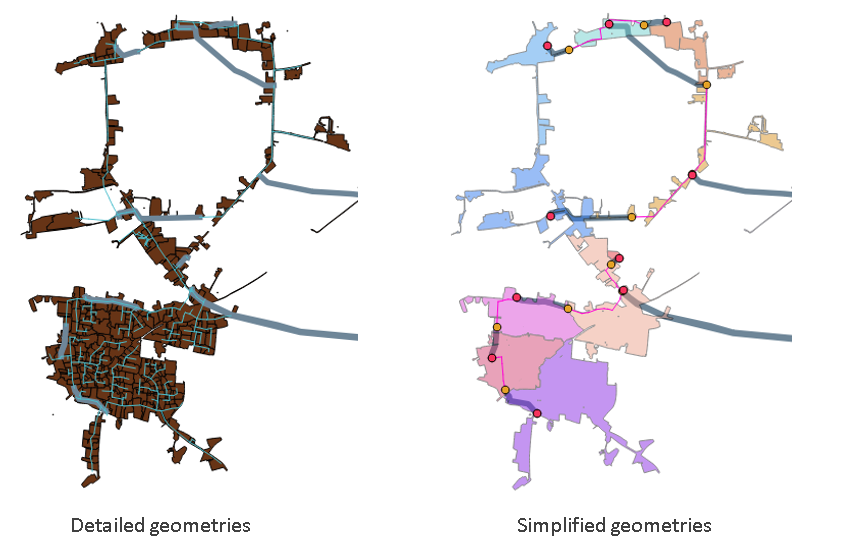
We have been working to speed up the creation of the simplified sewer network models in MAP Sewer so that we can rapidly create new models for new catchments. We have now automated the process of creating the main simplified model, and all the relevant geometries, from the detailed GIS layers that make up the ‘standard’ detailed models used by most water companies.

The objective of this work is:

  • Generate the MAP Sewer model inputs from the detailed model
  • To do this in an automated way using a combination of QGIS and PYTHON scripts
  • The methodology includes:

  • Derive location of Pumping Stations, Combined Sewer Overflows, Detention tanks, Weirs and Sluices
  • For each Pumping Station, use QGIS flow trace to identify the upstream conduits
  • Identify the sub-catchments associated to these upstream conduits
  • Dissolve the sub-catchments into one large sub-catchment
  • Aggregate the key sub-catchments properties
  • Calculate the main trunk sewer path and aggregate sewer length, gradient and diameter
  • Create the MAP Sewer nodes
  • The process takes several hours to run and the outputs are:

  • MAP Sewer configuration files. These are CSV files for each geometry. I.e. Pumping Stations, Combined Sewer Overflows, Detention tanks, Weirs and Sluices
  • One sub-catchment file containing all the dissolved sub-catchments. this is a KML file
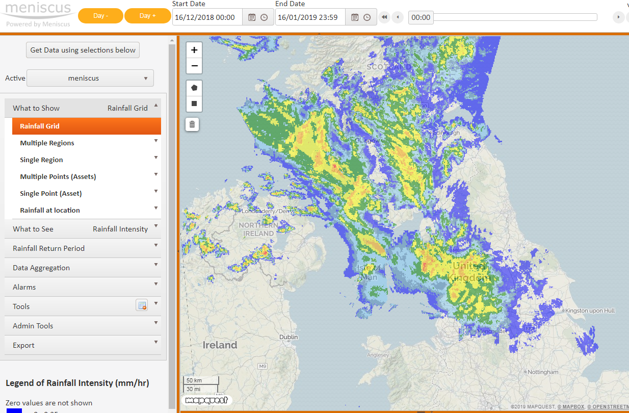
  • Once this is done then we can add some of the pumping attributes to the Pumping Station and Detention Tank geometry files and then load all the files into MAP Sewer from the dashboard. MAP Sewer then creates the geometries in a few minutes and the whole catchment is calculated in 20 minutes – this includes over 2 years of historic data all at 5 minute periodicity. We can now start to validate the model and to feed it with real time and forecast rainfall data.

    MAP Rain – rainfall map and analytics for urban areas

    We are pleased to announce the introduction of a new geometry in MAP RAIN that delivers big cost reductions. This is ideal for large rural agencies who want a rainfall map and rainfall analytics data for their urban areas.

    A new Multi-Polygon geometry delivers a rainfall map for just the areas that area of specific interest to you. Before this, we had to provide rainfall and associated data for the whole area of interest.

    Click here for more information on MAP Rain and rainfall map

  • Example: A Lead Flood Authority with a large predominately rural area of say 10,000km2 only wants real time and predictive rainfall analytics and access to FEH data for the urban areas, say 750km2. Previously, we had to provide rainfall data for the whole 10,000 km2 area and then add Polygons within this for specific catchments of interest. With the new Multi-Polygon geometry we can provide the customer with these analytics for JUST the urban areas. This delivers a big reduction in the cost of accessing rainfall analytics information from MAP Rain. I.e.MAP Rain prices are based on 750km2 rather than 10,000km2.
  • Example of multi-polygon area

    To receive a quote for using MAP Rain in your are then please send us a message from the Contact Page

    MAP Rain – updated imagery for rainfall map

    We recently updated MAP Rain to display rainfall as an image making it much faster to display new images. Previously we displayed rainfall for each individual 1 km square cell. MAP Rain processes data in km squares using the Ordnance Survey Grid Reference system but the dashboard uses the WGS84 projection. So to produce a suitable image we have to go through several stages.

  • Use the four corners of the visible area of the map and return the min/max Easting and Northings required to fully display the image. We add a small amount to each side to ensure it is covered on the screen.
  • Render an image for these Easting and Northings values from the internal grid that represents the data at the relevant time.
  • Then ‘warp’ this image to change the projection from a flat grid reference to the representation of that grid on the map. This is why the top and bottom of the returned trapezoid are curved and it is wider at the top than the bottom (imagine taking a sheet of paper and placing on a globe). We then display this image on the dashboard.
  • This process allows us to return different ‘zoom’ levels of the image with each having a better resolution. Most other mapping solutions limit the zoom level as they only display the one image for the whole of the UK.

    Click here for more information on MAP Rain and our rainfall map and dashboard